 As part of our brief we had to do an individual chart. This had to
contain 5 designers from distinctive eras. This could be done either with
Photoshop or other program or else handmade. As I am not really well in design
programs I stayed to the handmade chart. I could be much more creative.
Gerrit Rietveld
Our chart had to be an A2 size because if it was a smaller size the
information won’t fit. This chart was a visual chart so I challenged myself and
done only picture without any information. I tried to describe each designer
well with images.
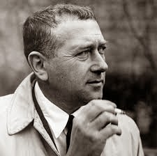
Marcel Breuer
Alvar Aalto
43 lounge chair
First I decided about the designers because they have to interrogate
with each other with their products. Where some got inspired, ideas, similarity
and others. I started off with Gerrit Rietveld with his Red Blue chair, in the
De Stijl era then I continued with Marcel Breuer with his Wassily chair that
got inspired from the Red Blue chair. After with Alvar Aalto I compared him
with Breuer with the bending of steel and wood and his famous Chaise Lounge.
The fourth designer is Ron Arad with his After Spring/ Before Summer Chaise
Lounge is similar to Aalto work. The last and not least Verner Panton with his
Panton chair that was made in plastic and for the first time in a single mold
like Arad made to his Chaise lounge one whole chair from a single
steel sheet.
I grabbed a thick cardboard to hold everything in place, cut it into an
A2 size. Then took some colourful cardboards and stick them to cover up the
grey thick cardboard. Then I cut some more colourful pieces but smaller making
them look as a page according to their size and colour. I did according to the
images I founded. I found around six images per designer to describe well what
is happening since it is a visual chart. I printed out the images, cut them and
stick them rendering to their place after each other. I finished up by giving
them a black boarder to distinctive from one page to another. On top of each
colourful cardboard I wrote from where to start and finish just by numbering
them. I tried my best to keep out from annotations and descriptive things.
This was my first visual chart I ever made, I think I did not went that
bad, in fact I feel great of what came out. I tried to be creative as much as I
can.


No comments:
Post a Comment