In October 1917 a small group of Dutch architects,
designers and artists join together and formed a new style called De Stijl. "Their main
attraction was for harmony and order
through a universal language of form. A different approach from the dada
movement." (Hans Janssen and Michael White (2011) The Story of De Stijl Mondrian to Van Doesburg). As from the nonsense of DADA they wanted to make something that could
be understood from everybody. This style was restricted to the use of straight
lines: only all about lines, even in architecture and design. Right angles,
straight lines and pure primary colours and non colours (black and white).
The De Stijl movement was known in almost every aspect of design whether in furniture, interior, textiles, graphics and architecture. They all had something to do with this style, the rules that they use can be applicable to many things. Nowadays can be found in toys, layouts, accessories and much more.
Red/Blue Chair
Gerrit Rietveld’s
revolutionary Red/Blue chair of 1918. The first thing you notice that this is a De Stijl furniture because of the primary colours, those where the mainly used on almost everything, the second thing is the straight flat surfaces of the chair. Rietveld's chair was exhibited at the Bauhaus in 1923 and
inspired Marcel Breuer’s later tubular metal B3 Wassily chair. Another examples like
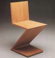
this are the Sideboard from 1919 and the Zigzag chair 1932-34, they were designed and developed.
The ZiZag Chair.
Architecture and interior design were
mostly done by the artist Van Doesburg and Gerrit Rietveld that they used the strong geometric forms, the rule of De Stijl it is also valid for buildings both in exterior and interior, in paint and furniture. A good example of their architecture and interior style is the Schroder House
in Holland, it was made in1924. This house had new methods of building it and a different look. First of all this style in architecture was a shock for the architects because nobody would ever image houses build this way. Openness and lightness, pillars that indicated forms and use of new
materials. The exterior was made up like large blocks of stone and placed onto each other giving that effect of depth and of course keeping with straight rectangular shapes. It had a lot of windows, all rounded with glass, pillars that they might be the support of the building like we use nowadays in skyscrapers they show the huge diameter of each column, different railing featuring the less is better, same with the rooms they got them to a smaller area to make them warm and welcoming. Although it was an open space the rooms where divided with patricians. The colour of the exterior are the shades of grey for a more structure colour but with pillars and other elements in primary colours for attention.
Reference:
:Hans Janssen and Michael White (2011) The Story of De
Stijl Mondrian to Van Doesburg.


